Fundação Oriente
For this project, we (it was a team effort) focused on working on a digital solution for Fundação Oriente, both desktop and mobile. While working on this, I did both UX/UI and put the pieces together until the final product was born.
We started by doing in-depth desk research to understand the users of museums, Fundação Oriente and its visitants, and the offers of national and international museums.
After doing some research, the target audience selected were the people who are looking to do a group visit/event in the museum. By looking at their current website we realised that the information architecture was lacking a decisive path, which made it confusing to achieve their goal.
Problem Statement
Lack of visibility and difficulty, for users, in finding the offer for schools and group activities, birthday parties, events spaces, ...
-

Heuristic Evaluation
To start understanding what we could improve on the client's side, we did a heuristic evaluation of the current website. We identified some of the issues that might be leading the users to leave the website or give up on achieving their goal.
-

Persona
Using a persona was a decisive step in this project so we knew who we were targeting with our solution. To come up with them we used our user research and heuristics.
By defining this persona, we knew that our project had to be something tailored to her needs and pain points.
When designing the UI, we always had in mind that our persona was not at ease with the internet and needed things to be very straightforward to navigate well - this was something that we revisited every time we made a new change or added a new feature.
-

User Journey
We mapped out the users’ steps, on the current website, to see how we could simplify their journey to help them reach their most important goals.
Since we were doing a new solution for a website that already exists we wanted to understand how the user felt while navigating and trying to understand what might be missing and what had to be different.
In each step, we tried to understand how our persona would be feeling so that we could improve any frustration.
By doing this, we understood what had to be changed and what things were too complicated.

Site Map
After analysing the current website, we realised that one of the main problems was the information architecture, which complicates the navigation for most users. Having that in mind, we mapped out the most important categories on the website and rethought its place and how they could be easier to find.
Visual Identity
-

Benchmark and Visual Language
Before going into our design, we researched some other museums and compiled them into a benchmark section so that we could understand the patterns and elements that are usually used. Out of each benchmark collected, we also identified which elements we liked the most visually and digitally so that we had some inspiration for our solution.
-

Moodboard
We analysed the client's online and offline communication and concluded that the use of Asian illustrations was very strong. Having that in mind we made a moodboard to compile the visual ideas we had. It was also at this point and in this mood board that we decided and added what the final typography and iconography would be.

Sketching
We started the design process with low fidelity wireframes, on paper.
The purpose of these sketches was mainly to brainstorm and be able to test things at an early stage of designing so that we could already understand what things wouldn't work and what things were a better path.
Knowing our persona affected the way we designed these sketches because we knew things had to be straightforward and easy to understand, we had to understand the user needs and apply them to the final solution.
Among the various sketches we made, we saw a difference in the type of layout we wanted the project to have.
We already had an idea of what we wanted when going to high fidelity by doing these wireframes, making it an easier process.

Digital Wireframes
After the paper designs, the next step of the process was to create some digital wireframes in high fidelity.
Transferring the paper ideas into digital was an extremely important step because it started to give form to the final result.
By doing this we started to understand the things that worked and the things that needed some rethought to become better.
Both low and high fidelity plays a very important role in the project. The high fidelity stage is very crucial to test and understand if the elements are the best they can be.
We focused mainly on the content we wanted to have on our pages at this stage.
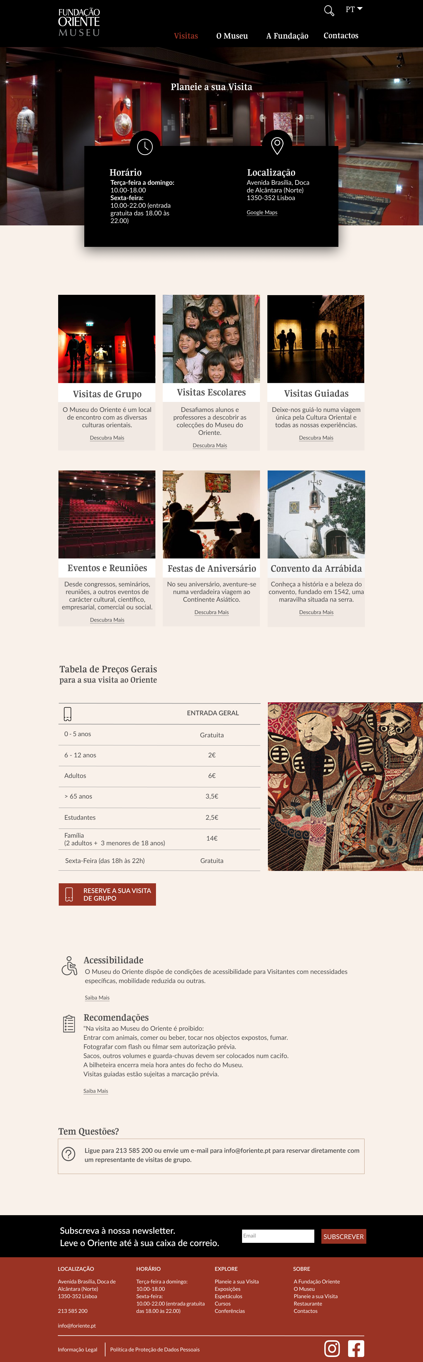
High Fidelity
Once we had all the elements and content mapped out, we started designing the final screens.
The visual concept of this project was to recreate the experience of being in the museum. Having that in mind the dark feel and the colours are chosen are both things that are present in the museum (we found this through our research).
We designed for desktop and mobile.
One of the main features of this design is the planner-style element that allows the user to see the museum's agenda and to add events to their own calendar.
Always having the persona in mind, we made choices tailored to them and how they would navigate (typography, colours, placement and elements were chosen to have in mind the persona's needs).
Pointing back to our initial goal of making it easier to plan a group visit, we designed a new "plan your visit" page and made it more accessible on the home page.