Boa Bao Mobile App
We were challenged to do a food-related app for this project. With this in mind, we brainstormed many possible ideas and did some desk research that helped us decide the idea we wanted to work on - an app for the Asian cuisine restaurant Boa-Bao.
After that, we also did in-depth research about the restaurant and its clients to further understand our app's end-user.
Problem Statement:
Management of expectation/perception of waiting time of waiting customers.
The app allows users to manage their waiting time before their table is available. The waiting lines in the restaurant may cause the user's (clients) to give up on wanting to eat there.

Surveys

At an early stage of the process, we wanted to gather information from the existing users of restaurants in Lisbon. We set up an online survey and asked people to fill it out to get our answers.
We used an online survey with mostly closed answers because we wanted specific answers for our questions. Our main goal was to create a general user profile and see what opinions/answers were most common, helping us have a correct path with a real data basis. For this survey, we had 46 respondents.
Based on the results, we could access that people use mobile apps related to restaurants and what information is most useful for them when searching for a restaurant (either the menu, images, etc). This helped us have a clear knowledge of what content is more/least important to the users.
Persona

For this specific project, we were given a pre-made persona which helped us decide what our project would be and guided us along the way in our decision making.
The persona helped us define some features that adapt to her needs and goals. For example, since our persona is a food photography lover, we added a feature for the users to be able to take photos with the app and share them directly.
While designing and creating the app features, we always thought back to this persona and their needs.
-
Understanding the User
To better understand our persona and the app users, we mapped out their needs, the context of those needs and made some user stories.
This was also a very useful step to help us define what features were most/least important to users and how they should be displayed in the app.
-
User Needs & Context
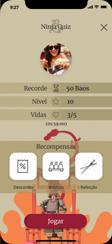
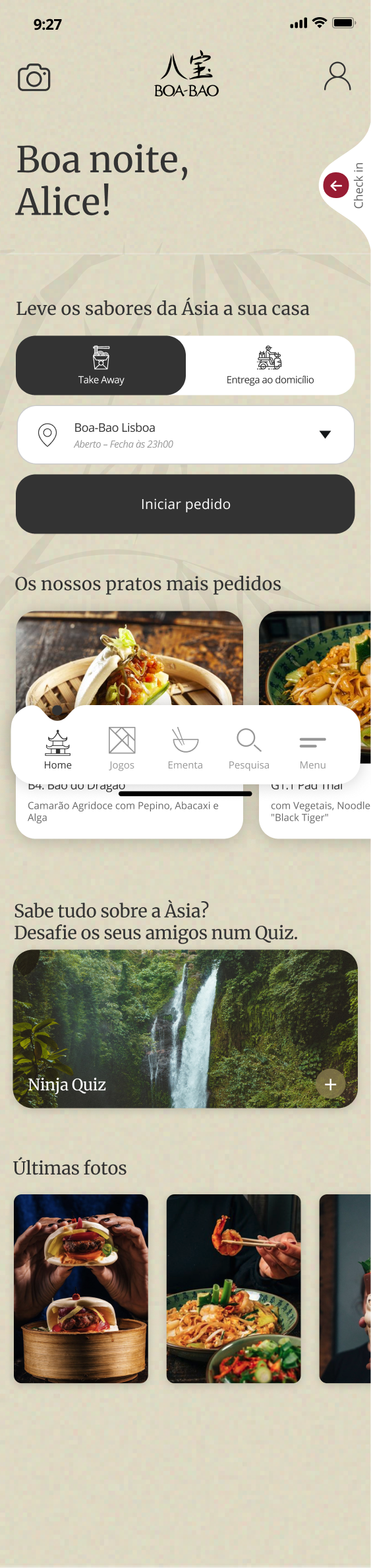
Have entertainment while waiting in line (socializing with the company).
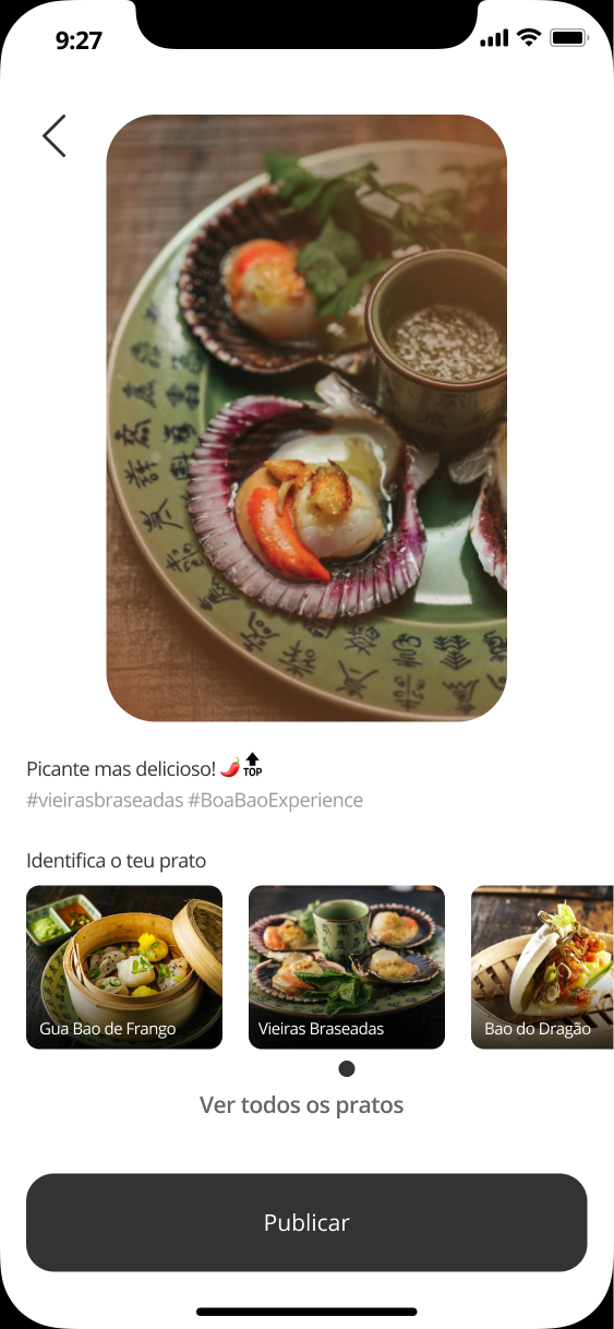
Being able to take and share photos easily.
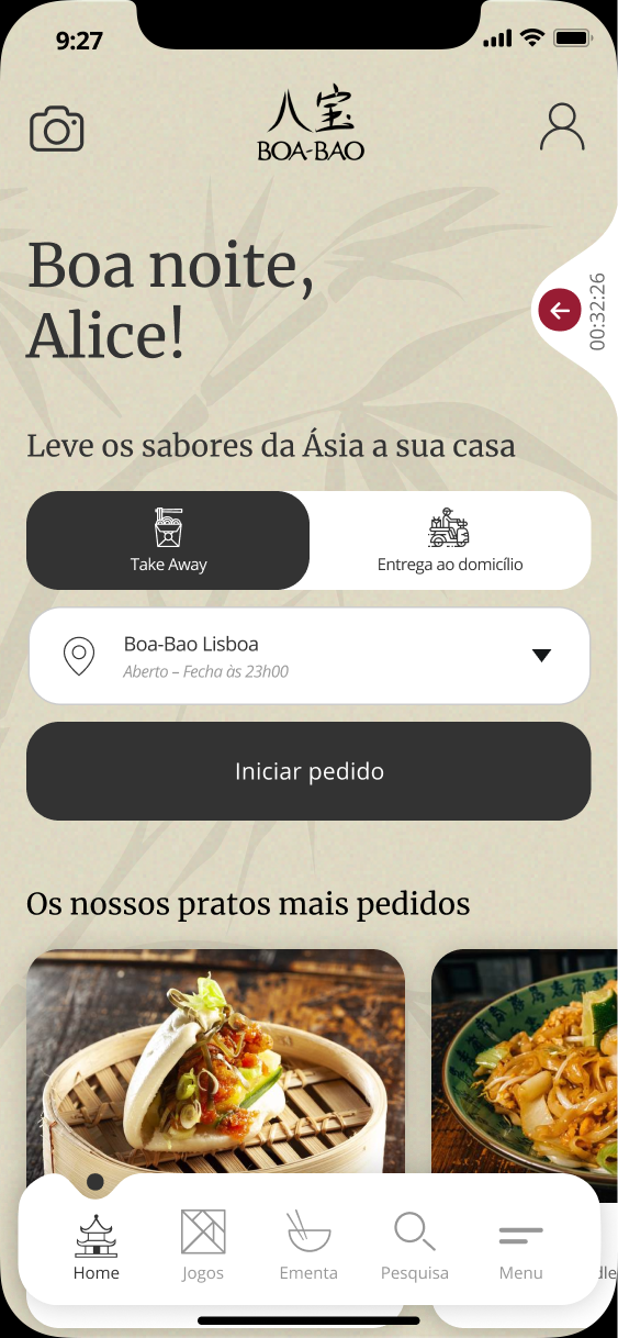
Place the order quickly and effectively.
-
User & Job Stories
"As a Foodie, I want to share photos easily so that I can show the experiences to my friends and followers."
"When I go out to dinner with my friends, I want to have activities to do, to be able to socialize and lose the perception of waiting time."
Main Features
-
Occupation of time and way of socializing with the company.
-
Take photos and share directly on the app, with filters and hashtags.
-
Help with time management and the possibility of effective updating/change, in the event of a change in the number of people.
-
Place the order through the app quickly for take-away, delivery or queuing on site.

App Map
After understanding the problem we wanted to focus on, our user and its needs, and which features were important to create, we made an App Map.
This was a very decisive step before going into wireframing as it helped us know the screens we needed as well as the content and features needed for each of them.

Benchmark & Visual Language
Before entering the design phase, we researched some other food and restaurant-related apps and compiled them into a benchmark section, so that we could understand the patterns and elements that are usually used and the things that we'd like to implement in our solution.
We selected which elements we liked the most and that we thought would compliment and function well in our solution.

Moodboard
We analysed the client's visual communication to help us decide what design style we wanted to implement on our app so that it would be coherent to the brand.
At this point, we decided on the imagery style, typography and iconography that we wanted to use. We compiled everything in a moodboard.

The Concept
At this stage, when we understood the brand, the user and the app we wanted to create, we put everything together to create the concept. We decided that we wanted our app to focus on 3 main pillars: Relational | Sharing | Sensory.
Relational - the app creates a relationship with the user and invites them to come back and interact with it. Besides that, it also helps the user to interact with friends.
Sharing - a restaurant is a place for sharing, and so is this app. The users can share their experience through photos, and play games with their friends, for example.
Sensory - through the food, the games and the interaction, this app is meant to be more than just a tool but also a journey, for its user.

Lofi & Hifi Wireframes
While designing our solution, we went through different design stages.
First, we did some paper sketching, lo-fi wireframes, to test out some of the beginning ideas of our features. After gathering the data from that, we jumped to the hi-fi wireframes where we did the layout of what we wanted our app to look like.
At this stage, we also had in consideration the typography, icons, and microcopy for our final design.
The Final Product
See some shots of the final prototype and the solution that was explored.