Fruta Feia
For this project, the main objective was to create a new adhesion/subscription process for an organisation called Fruta Feia (an initiative that aims to go against food waste and make baskets with wasted fruits and vegetables, solely because of their atypical look). For this, we designed for desktop, mobile and also app.
This concept runs on a subscription model where people can get their basket weekly, after subscribing and applying to a delegation near them.
-
Research
Our research phase was very important to fully understand the context, the project, the environment and the players involved. For this we did:
Desk Research;
Interviews (to consumers, farmers and Fruta Feia managers);
Customer Journey (on the current website) of the adhesion process;
Brand guidelines (understanding the way they communicate both digitally and physically as well as visual guidelines - colours, icons, typography).
-
Interviews
To better understand the people involved in Fruta Feia, we did some interviews that gave us real-life data, which answered our questions and assumptions.
Fruta Feia Managers - to have an in-depth perception of the business side and better grasp their objectives and how they aim to communicate with their clients and various audiences.
Consumers - to know what they look for when they go to Fruta Feia's website and understand how their process of becoming a client and subscribing to the service worked and what could be improved.
Farmers - to better understand their needs as partners to the business and the key features that they look for when trying to find new business in this field.
-
Personas
After identifying the stakeholders of Fruta Feia and analysing the results of our research we developed two important personas for this project: the consumer and the farmer.
We realize that this particular business has these two main clients, and for each of them there are different needs and different ways to approach them.
Defining these two personas was very helpful two understanding the different ways that we could cater to their necessities.

Problem Statement
With all the research done, we concluded that Fruta Feia had two problems, related to their different publics: the lack of trust from the farmers (who don't understand how their waste could be a source of income) that leads to long waiting lists (the consumers subscribe to the service but have to wait a long time before starting to get their baskets).
With all the research done, we concluded that Fruta Feia had two problems, related to their different publics: the lack of trust from the farmers (who don't understand how their waste could be a source of income) that leads to long waiting lists (the consumers subscribe to the service but have to wait a long time before starting to get their baskets).
-

Customer Journey
Before making a new subscription process we needed to understand the current one, so we went through the process ourselves, putting ourselves in the shoes of the consumer.
Through this process, we identified the user's pain points and feelings in each step, so we knew which steps needed improvement and to evaluate it as a whole.
In this case, we understood that the process wasn't very user friendly and almost every step had some type of problem.
-

Task Flow
After understanding our problem, user and needs to meet, we started to develop the new adhesion process, by thinking about how we could make it a better experience:
Interactive - a process that tells a story and keeps the user engaged.
Easier - having fewer steps to make it more comprehensive and less frustrating.
Honest - telling the user upfront that there's a waitlist before being able to get the basket and giving them a possibility of tracking the wait progress.
-

Site Map
By analysing their current website, we realised that the information architecture had to be rethought for a better experience for the users. Having that in mind, we simplified the site map, organising its content in a more straightforward and intuitive manner.
Features
Thinking about our consumer persona (and their needs), our goal for this project and the client, we came up with a set of features, that would make the user experience better:
A progress of the waitlist - so the user knows what to expect;
An area for recipes shared by the many clients, reinforcing the community feeling;
Events/Workshops, so the user can engage with Fruta Feia, even outside the digital world.
-

Moodboard & Benchmark
Keeping the brand in mind and its values, we wanted to have the fruit and vegetables in the spotlight of our digital solutions from a visual perspective.
We researched examples that inspired us (visual and animation) and that we thought would be a positive asset for our solution.
-

Visual Identity
As a brand and business, Fruta Feia already has a strong and good visual identity that works digitally and physically and is appealing to their audiences.
Having that in mind, we decided to keep the same colours, illustrations (the use of fruits) and title font. It was important to have the brand of Fruta Feia better displayed on the digital solutions.
-

Concept
Before designing our solutions and after all of the research and strategy, we came up with a coherent concept for the brand, processes, and users.
For the adhesion process and to make it an overall engaging experience, we came up with the concept of doing storytelling of planting a seed, making the analogy of the time it takes for a flower to grow to the time it takes to apply and be able to use the service.
-

Wireframes (Lo-fi and Hi-fi)
After all the research and brainstorming, we already had some ideas to start transforming into wireframes.
To do that, we started by doing some lo-fi sketches mapping out the vision of our idea and what we wanted the process to be like.
This was a significant step because besides helping us plan the visual layout of our solution, it was also crucial for testing our ideas with the users and iterating them after analysing the feedback.
The Final Product
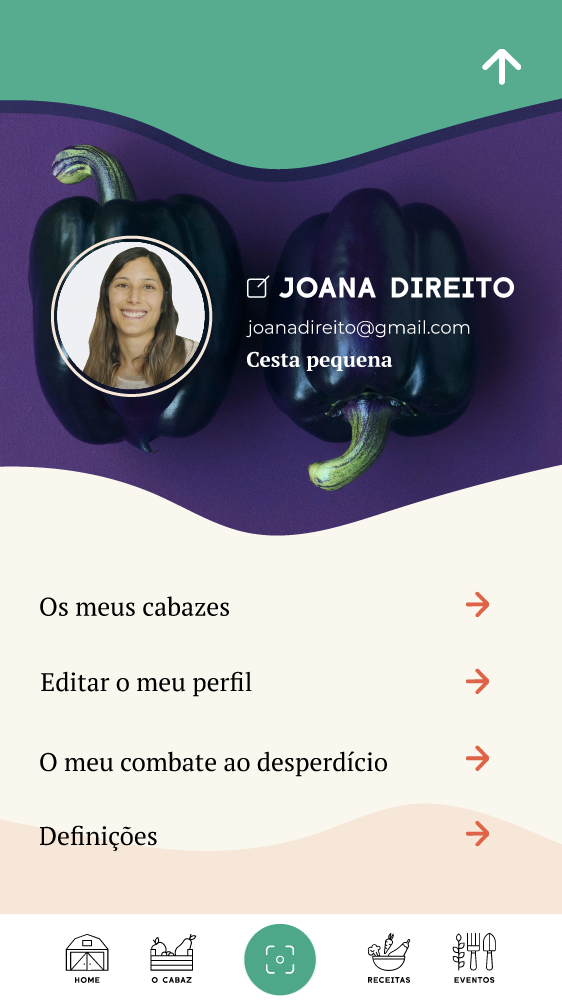
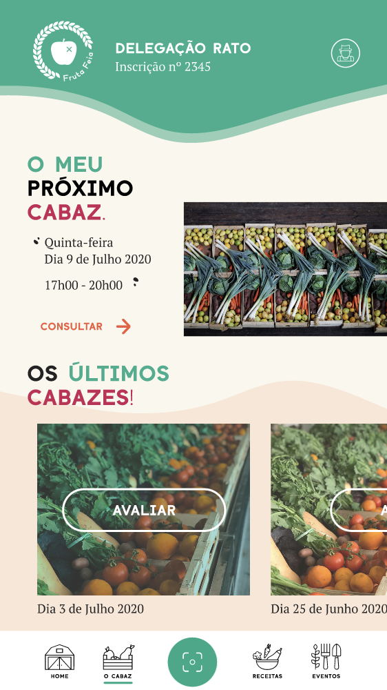
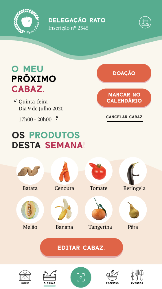
See some shots of the final prototype and the solution that was explored (on the first row is the app and the second row is desktop and mobile).


